Archived Next generation Target sign

Status
Not open for further replies.
Joined
Nov 7, 2015
Messages
64
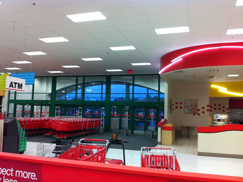
I took some pictures of the entrance signs being replaced today at a very old Target (opened in the early 70s). This store is not undergoing a remodel right now, so I'm not sure why they suddenly decided to update the signs after all these years. I almost like the new sign, except for spelling "target" instead of "Target."

targetnew.jpg
targetold.jpg
 
Oooh, lowercase! Apparently everything is lowercase in the future.

a s t h e t i c

sb-129.jpg


Helvetica-Dominates-Logo-Design1.png
 
Interesting I haven’t seen that yet. Thought Target was trying to get away from red. I’ve seen stores just have the Bullseye on the store fronts
 
A new flex format store is opening near me in an existing shopping center. They already have put Target on the road sign and it has the current logo and font. However, the interior of the store has been gutted and they are just starting to worked on it. There isn't even any signage on the building itself. From the street it looks like you will find an open Target in the shopping center but you can't find one. It will be interesting to see if this new signage goes up there.

Also, does this mean we have to start writing "target" here on TBR?
 
Just a theory but it’s possible that there was some damage to the old sign, structurally or otherwise. The cost of replacing it with a same type sign, only to be changed again later would’ve been extreme, especially if it’s that old of a store. Suppliers change, vendors change, technology changes, so they may have just decided to replace it with a brand new sign. This is definitely the next gen, timing could’ve played a role in it ending up at a seemingly random store.
 
Actually a practical change since a white background is more noticeable when weathered.
Ours was an older two-sectioned sign that had the top half fading faster than the bottom before they replaced it a few years ago.
 
Just a theory but it’s possible that there was some damage to the old sign, structurally or otherwise. The cost of replacing it with a same type sign, only to be changed again later would’ve been extreme, especially if it’s that old of a store. Suppliers change, vendors change, technology changes, so they may have just decided to replace it with a brand new sign. This is definitely the next gen, timing could’ve played a role in it ending up at a seemingly random store.
There's actually 2 signs, 1 for each entrance. So whatever it was would have had to affect both or be bad enough on 1 for it to make it worthwhile changing both.
 
There's actually 2 signs, 1 for each entrance. So whatever it was would have had to affect both or be bad enough on 1 for it to make it worthwhile changing both.
Yeah, it could’ve been that they couldn’t repair one or both due to parts availability or something.
 
We still have out 50ft tall pylon sign from the original opening...it looks awful.
 
Our pylon actually looks good. Dumb fuck BP thought the sign should be even taller but fortunately corporate turned him down. We need a new sign on the store front so the birds can stop shitting on the one at the store I was at before my departure.
 
Last edited by a moderator:
Could also be related to possible changes in local zoning laws. Some areas get really specific on what is and isn't allowed. Anything from size, height, shape, color, even down to the style and color of the font used, can force businesses to make a change. Most places would grandfather in old signs which could be the case if repair of the old sign wasn't possible.

Or Target just decided they wanted a new sign.
 
Interesting I haven’t seen that yet. Thought Target was trying to get away from red. I’ve seen stores just have the Bullseye on the store fronts

I’m seeing a scaling back on red because it’s a pretty aggressive color walking in to a super bright red building. The grays and whites with modern fixtures and lighting are pretty nice compliments to each other.

We have a prototype store in my district that tried red/white then red/gray/white schemes and the 3 color scheme had way to much going on. Now it’s white/gray with some red trim and it’s super nice. A few stores in the area got that white/gray package now
The store I had a repaint last year. The store front was changed to a gray/white package. Before it had a whole bunch of colors going on. The new package was simpler. Receiving dock and back of store had a different color than front of store but it was much simpler than before where we had tan, red-brown, red, white going on.

In store our colors are all sorts of colors. Tan wall armor, red wall armor, different shades of white. Not to mention the cafe package where its concord ivory, red, dark red.
 
Not 100% sure but I know there is such a thing for blue vestibules for stores.
 
Not 100% sure but I know there is such a thing for blue vestibules for stores.
I commented on a yammer post and the pmt said supers have blue vestibules, but when I was out of state and stopped in a super I don’t remember seeing that.
 
I commented on a yammer post and the pmt said supers have blue vestibules, but when I was out of state and stopped in a super I don’t remember seeing that.
Same. I went to a Super last night and I don't recall seeing it either. But I have seen blue vestibules
 
Status
Not open for further replies.
Back
Top